Keep It Neutral Case Study
 X
X
Keep It NeutralCase Study
An advertising campaign targeting teenagers between the age of 13 to 19 to raise awareness about HIV and AIDS. Our team came up with the title of Keep It Neutral to bring the HIV positive and the HIV negative together in order to create a neutral space to fight the stigma around the topic. The campaign’s message is; connection through education.
- Kayla Chang as motion designer
- Luisa Valero as designer
- Kahani Gajjar as designer
- Sandra Tsao as back-end developer
- Me as front-end developer
Team:
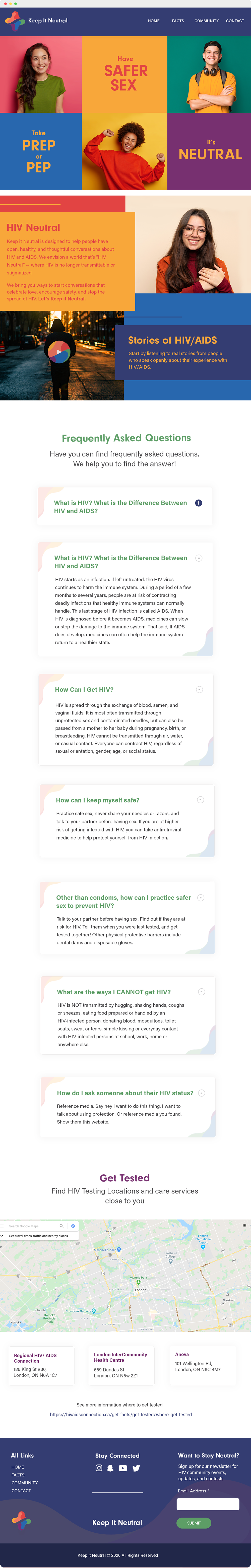
My role as the front-end developer was to bring this beautiful and colourful design to life through a fully dynamic and responsive website where all content is pulled from a database. I used HTML5, CSS3, Sass, Vue.js, Ajax and Php. Our back-end developer was to create a CMS for this website. I also added a gulp.js file for image minification and CSS vendor prefixes. I always make sure to follow accessibility standards when I'm writing HTML, like organizing the document outline and adding an alt tag for images.
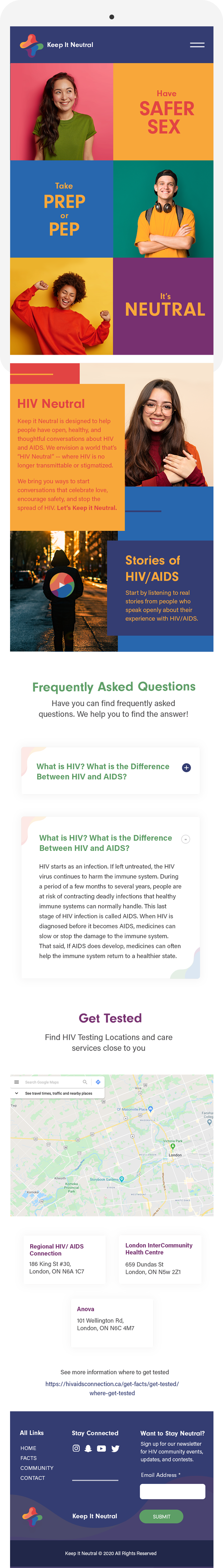

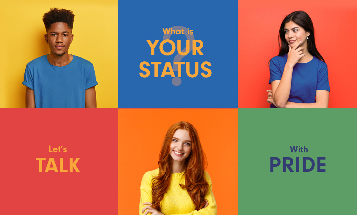
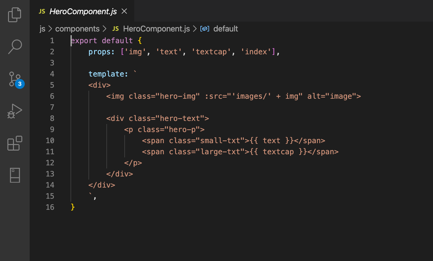
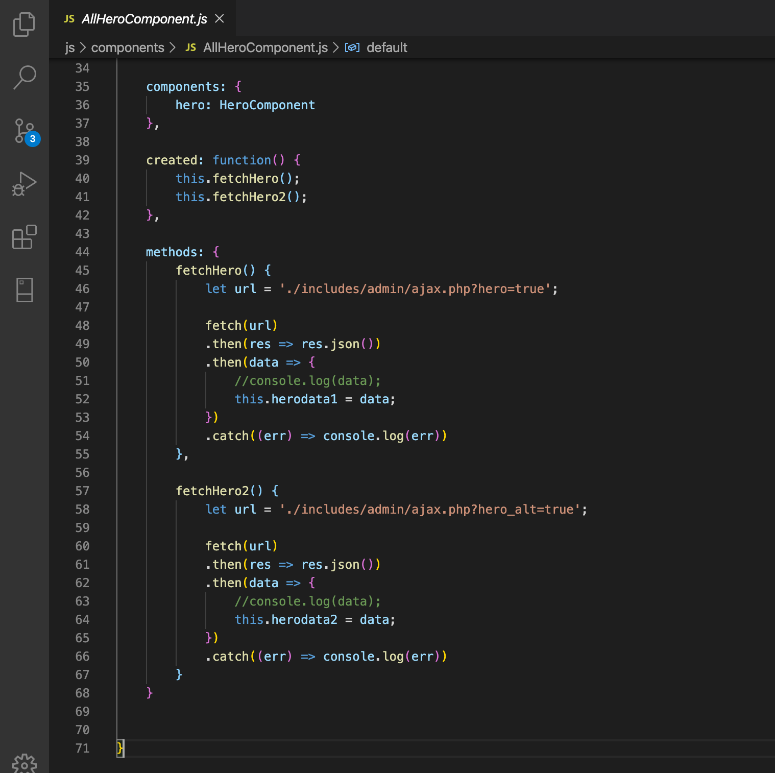
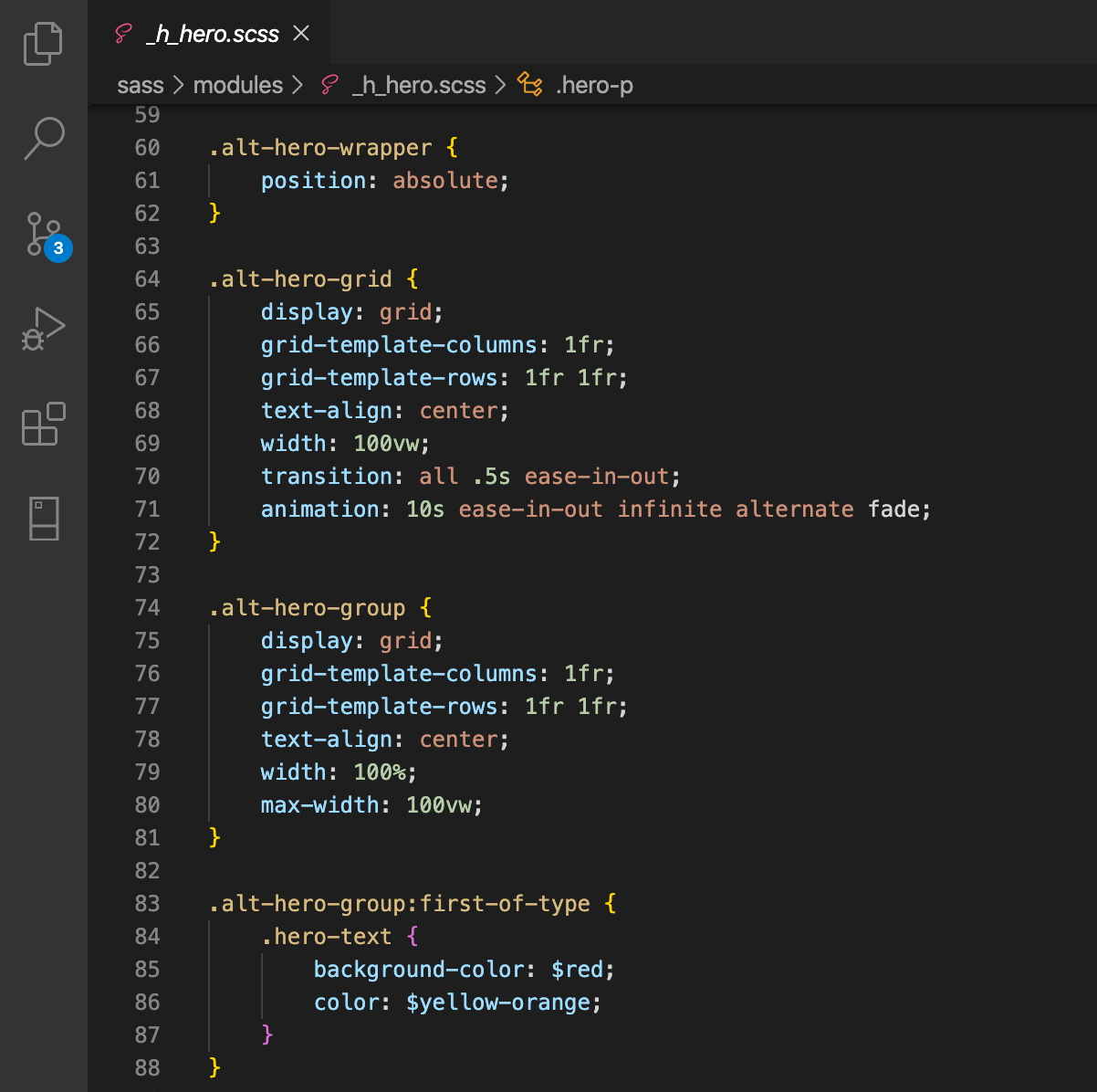
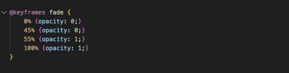
The hero section contains elements form the campaign visuals. The messages and images change to engage the user and communicate more of the campaign messages. In order to achieve that I used CSS animations. The first set of hero images are styled in a grid that switches from 1 column in mobile to 2 columns in tablet to 3 columns in desktop. The challenge for me was figuring out how to position the second set of hero images using (position: absolute). The problem with using (position) is that elements are not part of the normal flow anymore, thus can’t be a part of the grid system or any other system. After multiple trials, I found the solution, which is to create another div for the second set of hero images and style them with grid just like the first group, then to wrap this second section in a div and position it absolutely on top of the first group of hero images. Another challenge was creating the template for the hero component to be populated by the hero images and text array. The hero component consists of one image and one text element. I used CSS to switch from flex row to flex column to adapt to the changing layout of the hero images from mobile to tablet to desktop view.

The community page connects the users with the events happening in the community, as well as our Instagram feed. We want people to be able to talk and share their stories, so we created a form where the user can submit their anonymous story, which then would be shared through our social media channels.

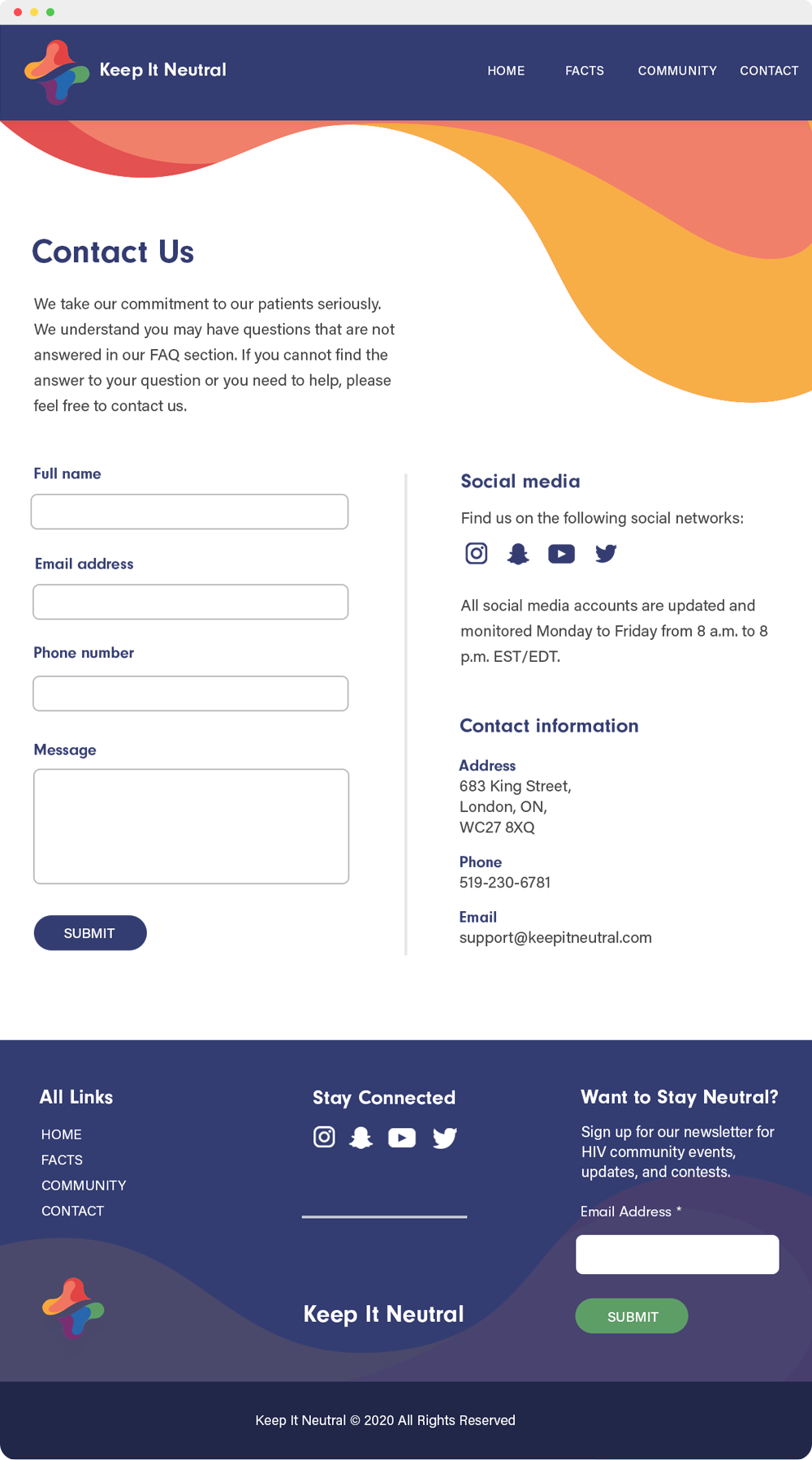
Our contact page has the contact form, social media links and contact info. We plan to add a section to download the campaign assets.
Feel free to check the project repository on github here.